
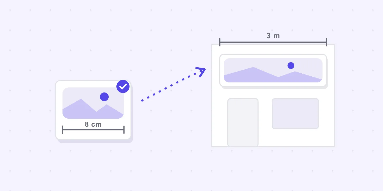
A sign proof has a problem a leaflet proof does not. The customer approves an image about eight centimetres wide, on a phone, in a coffee shop. What they are buying is three metres of fascia that will be screwed to a building and read from across a road.
Everything awkward about sign proofing follows from that gap: the customer cannot see the thing they are agreeing to, and unlike a print run, the mistake does not get quietly reprinted. It gets uninstalled.
What makes a sign proof different
Scale is invisible on screen. Type that looks generous in a preview can be unreadable at the actual viewing distance, and a logo that looks balanced at 8 cm can be lost on a wide fascia. The customer has no way to judge this, and will not think to ask.
The copy usually comes from the customer, and is usually stale. Phone numbers, web addresses and opening hours arrive from an old letterhead or an out-of-date website. On a flyer that is a reprint; on an aluminium tray sign it is a new sign.
The person approving may not be the person who can approve. Landlords, franchisors, planning conditions and shopping-centre design guides all have opinions about fascia signage, and they surface after production more often than before.
The colour conversation is different. A brand colour that is right on paper is a different thing on translucent vinyl lit from behind at night. Screen approval cannot settle it, and pretending otherwise sets up an argument at handover.
There is no cheap second attempt. A wrong menu is a bad afternoon. A wrong sign is a return visit with a van, a lift, and an installer whose day you have already paid for.
What to put in front of the customer
The fix is not a better preview. It is a proof that carries the facts the preview cannot show.
State the finished size in the proof itself. Not in the email — on the artwork, as part of the proof: finished size 3000 × 600 mm. It travels with the file when the file is forwarded, which the email does not.
Give the viewing distance a sanity check. One line does most of the work: this will be read from about 15 metres — the smallest text here is 90 mm high. A customer cannot evaluate "90 mm", but they can evaluate the sentence next to it: for comparison, the phone number on your current sign is about 60 mm.
Check the supplied logo before you scale it. The artwork a customer sends is usually the one off their website, and a 600-pixel logo that looks perfect in an email is a soft two-metre fascia. What a file can print at is a ten-second check in the browser, and about 150 dpi at finished size is the working floor for something read from a few steps back.
Make the customer's own details their job, explicitly. Ask for confirmation of the phone number, the web address and the opening hours as a separate question, in the same message. Left implicit, these are the details everybody assumes somebody else checked.
Ask who else has to say yes, before you design. "Is there a landlord, franchise or centre approval needed for this?" is a question that costs one line and occasionally saves an entire job.
Say plainly what screen colour is worth. Colours on screen are a guide rather than a match — if the brand red matters, we should look at a printed sample on the actual material. This is the sentence that prevents the handover argument, and it has to be in writing before installation, not after.
Sign-off for jobs that get installed
Two habits are worth more than any tool on installed work.
An approval must name the version. "Approved" against a job that has been through three rounds means nothing a week later. "Approved v3" is a fact you can act on. If the yes arrives by phone — and on sign work it often does, from a site visit — write it back the same hour: confirming you approved northgate-fascia-v3.pdf today at 15:40, going to production on that basis.
Photograph the site before the artwork is final. Not for the proof; for the argument that does not happen. A picture of the wall, with the existing sign on it, resolves half the "it looks bigger than I imagined" conversations before they start.
Where a review link helps
This is our own tool, so weigh the paragraph accordingly.
Proofavo gives the customer one link instead of an attachment. They open it with no account and no app — which matters more on sign work than on print, because the person approving is often standing in the unit they are about to put the sign on, holding a phone.
Their comments land as pins on the artwork itself, so "the phone number is wrong" arrives attached to the phone number rather than as a sentence you have to map back onto a drawing. The approval is bound to the exact file and produces a downloadable record naming the version, with a SHA-256 fingerprint of the approved artwork — which is the document you want when a landlord asks why the fascia says what it says. The colour caveat is on the reviewer's screen, not only in your email.
Flat workspace pricing, from $29.90/month, and the people approving your signs never cost a seat — including the landlord you had to loop in.
What it does not do: it is not a preflight tool and it does not check your dimensions. It is the layer where a human being agrees to a specific file, and where that agreement is written down.