
A print proof is the copy of your job you get to reject before it becomes two thousand copies you cannot.
That is the whole idea, and it is worth stating plainly because the word covers at least six different things — a PDF emailed on a Tuesday and a colour-managed sheet pulled on the actual press are both called a proof, they cost wildly different amounts, and they settle completely different arguments.
This page is the explainer to send a customer who asks what they are looking at, plus the glossary of terms that come up while they read it.
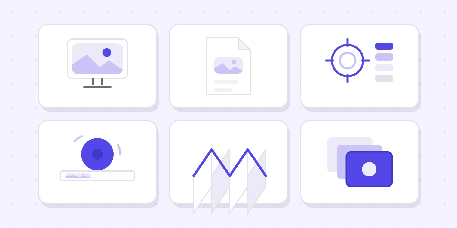
The six kinds, and what each one actually proves
Soft proof (a PDF or an on-screen preview)
The default. You export a PDF or share a link, the customer looks at it on whatever screen is nearest, and approves.
What it proves: content, layout, spelling, page order, and that everyone means the same file. That is the majority of everything that goes wrong, which is why soft proofing is the workhorse of the industry.
What it cannot prove: colour. A phone screen is backlit, uncalibrated and set to whatever brightness the last person left it on. Anyone who approves a brand red on a screen has approved the idea of a red.
Cost: effectively nothing, which is the other reason it dominates.
Hard copy proof (a printed sample, not from the production press)
Printed on a digital device or a proofing printer and posted or handed over.
What it proves: how it feels in the hand, how the trim sits, whether the type is readable at actual size, and roughly how the colour will land.
What it cannot prove: exact production colour, unless it is a contract proof (below). A laser-printed sample is a size and layout check wearing a colour costume.
Cost: materials plus a day or two of post. On short-run digital work it can cost close to nothing, because the device that makes the proof is the device that makes the job.
Contract proof (a calibrated, colour-managed hard proof)
A hard copy produced on a profiled device to a known standard, so it can be contractually held up against the printed result.
What it proves: colour, within a stated tolerance, and it is the only document that gives both sides something to measure against instead of argue about.
Cost: charged per sheet, and the price is for the calibration discipline rather than the paper. Worth it when brand colour is the point of the job — packaging, corporate identity work, anything reprinting against an existing shelf item.
Wet proof / press proof (pulled on the real press, on the real stock)
The real thing, run short.
What it proves: everything — ink on that paper, that press, that screen ruling, with the actual dot gain.
Cost: make-ready on a production press, which is why it prices like a short run of the job itself. Reserved for long runs and jobs where a colour failure would be catastrophic.
Plotter / imposition proof (the folding dummy)
A full-size, usually low-colour print of the imposed sheet, folded the way the job will fold.
What it proves: page order, orientation, creep, that page 7 is not upside down, and that the fold lands where somebody thought it would. On any folded or bound work, this catches errors no PDF ever shows.
Cost: cheap. Frequently skipped. Frequently the reason a reprint happens.
Screen or colour-separation proof
Specialist output for screen printing, packaging and anything with spot colours, showing each separation.
What it proves: that the separations are what you intended, and that white, varnish and cutter guides are on the layers they belong on rather than in the artwork.
Which one you actually need
The honest rule: use the cheapest proof that can settle the argument you are likely to have.
| The risk you are worried about | The proof that settles it |
|---|---|
| Wrong prices, wrong phone number, missing page | Soft proof (PDF or link) |
| Type too small, product feels wrong in the hand | Hard copy proof |
| Brand colour must match an existing item | Contract proof |
| Long run where a colour failure is catastrophic | Wet proof |
| Folded, bound, or multi-page imposition | Plotter proof |
| Spot colours, white ink, varnish, cutter | Separation proof |
Most disputes in most shops are the first row. Buying a contract proof for a job whose real risk is a typo is spending money in the wrong place — and skipping the plotter proof on a folded brochure is saving money in the wrong place.
How to approve a proof without regretting it
Whichever kind is in front of you, the approval itself is the same short discipline.
Check the facts, not the design. Names, prices, dates, phone number, web address, and anything legally required. Customers read a proof like a design and catch none of these unless asked. The full list is our proof approval checklist.
Look at every page. The back of a menu and the inside of a folded card are where the old phone number survives.
Name the version in your yes. "Approved" is an opinion; "Approved v3" is a fact. If the yes happens on the phone, write it back the same hour.
Say what colour means here. If the approval is on screen, both parties should have it in writing that screen colour is a guide rather than a match — before production, not after.
Change nothing afterwards. A correction made after sign-off produces a file with no approval behind it, which is the most expensive small edit in the trade.
Glossary
Soft proofing — evaluating a job on a screen rather than on paper. Reliable for content, unreliable for colour unless the display is calibrated and the lighting controlled, which in practice it is not.
Hard copy proof — any physical printed sample.
Contract proof — a hard proof made to a defined colour standard so it can be measured against the production result.
PDF proof — a soft proof delivered as a PDF. The commonest proof in existence.
Wet proof — a proof pulled on the production press with production ink and stock.
Preflight — the automated check that a file can be printed: fonts embedded, images resolved, colour spaces sane. It happens before proofing and answers a different question.
Effective resolution — the dpi an image actually has once it is scaled into place. A 300 dpi photo enlarged 400% is a 75 dpi photo, and the number written in the file says nothing about it. Our free image resolution checker works this out for a picture, and the PDF dpi checker does it for every image inside a document, page by page.
Bleed — artwork extended past the trim so a slight cutting variance does not leave a white edge.
Trim and safe area — where the sheet gets cut, and the margin inside it where nothing important should sit.
Dot gain — ink spreading on paper, making printed tones darker than the file. The main reason a screen flatters a job.
Overprint — printing one ink on top of another rather than knocking out. Misapplied to white, it makes things vanish on press while looking correct on screen.
Imposition — the arrangement of pages on the press sheet so they read correctly once folded and trimmed.
Where we fit
This is our own tool, so weigh it accordingly.
Proofavo is soft proofing done properly: the customer opens one link rather than an attachment, comments land as pins on the artwork, there is exactly one current version, and the approval is recorded against that exact file with a downloadable record naming the version, the person, the time and a SHA-256 fingerprint. Reviewers need no account and never cost a seat.
It does not make hard proofs, it does not manage colour, and it will not preflight your file. It settles the argument in the first row of the table above — which is the row most shops actually lose. For how it fits a print shop's day, see proofing for print shops.